
My final Ace Combat magazine spread with its design inspired by the menu presentation of Ace Combat 6.
For my final magazine spread, I considered doing one about an experimental plane that was intended to be an air racer until it was cancelled because of WW2. I would still be making use of typography but I would not be able to use my own images of the plane so I wanted to create something that involved using my own images. While practicing with using Illustrator I created some updated designs of my characters for personal uses but soon found uses for them for my next magazine- It gave me an idea to create a made-up magazine advert for a game that would be based on my illustrations.


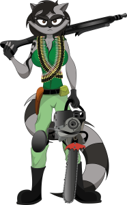
These here are my updated characters- former British soldier Sylvia Vixen and former U.S. Marine Shelby Raccoon created as part of my Illustrator practice and I found a use for both of them for my game advert-

Fonts used- 

Before I created this page, I researched other game advert examples such as these-


One of the things I took into account for these adverts in terms of typography and structure was the positioning of logos and ratings to create a border grid across the pages.
One of the things I would change next time is the positioning of the title Obliteration- since it’s in the middle it means that the pages will fold in the middle of the title, although this might not bother everyone so much since you can still read the title such as this example-

My choice of type for the title ‘Obliteration’ is somewhat influenced by one of the type faces for War of the Worlds (2005)
I tried to use a type face other than Impact, which may look similar to the War of the Worlds font but I wanted to pick a font to define my fictional game from War of the Worlds rather than make it look similar.


